5 Website Mistakes That Are Costing You Clients (And How to Fix Them Fast!)

Some links in this post may be affiliate links. That means if you click and purchase, I may earn a small commission (at no extra cost to you). I only recommend things I’d actually use myself because trust > everything.
Not getting the leads or sales you expected from your website? You're not alone.
Your website might be stunning, but if it’s missing key ingredients, your dream clients will bounce before they ever book. So, let’s fix that.
Here’s what’s costing you clients and how to fix it fast.
❌ Mistake #1: Confusing, Cluttered Messaging
Your website isn’t just a digital brochure it’s your 24/7 salesperson (no PTO), it should be catching you leads, while you’re catching a few Zzz’s.
But if your messaging is all over the place, you’re losing leads no questions asked.
The average visitor decides whether to stay or bounce in just 3–5 seconds (check your website’s bounce rate).
That’s barely enough time to read a sentence so clarity is king on your website, especially your homepage.
Quick Fix: Ask yourself: “Can a new visitor instantly tell who I help, what I offer, and what to do next? ie: how they can pay you?
If not, simplify it.
Use a clear headline that addresses a pain point or outcome, followed by one bold call-to-action that naturally leads them to check out.
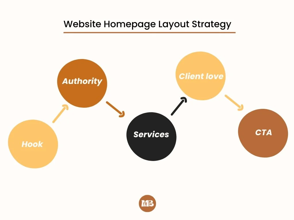
💡Mistake #2: Zero Strategy (Pretty but Pointless)
Gorgeous visuals won’t save a site with no structure.
A strategic website guides visitors from point A (confused) to point B (clicking your “Book Now” button).
Without strategy, you’re relying on luck.
And luck doesn’t scale.
Luck will leave you with inconsistent income and missed opportunities to serve the very people you actually want to work with.
Your Action Plan: Use a clear flow and map out your site like a journey.
What questions will your audience have at each section? What proof do they need before saying yes?
Aesthetic, but you’d never know what they actually do or how to work with them.
Bonus Tip: Even a 1-page website can convert if it’s intentionally designed.
😬Mistake #3: DIY Branding That Feels Off
If you’re relying on Canva and vibes alone, your brand may be doing more harm than good.
Now don’t get me wrong, I LOVE Canva but I feel like a lot of business owners don’t use it as strategically as they should.
If this is you, don’t worry we’re about to get your brand all the way together!
Generic visuals = forgettable brand.
And forgettable brands don’t get referrals.
What to Do Instead:
Use 3–5 consistent brand colors (not 28).
Choose one primary font and a secondary font to stick to (stop changing it every time you click into Canva).
Stop using random stock photos at the top, use ones that feel like you (match your brand style)
Need help choosing visuals? Check out my services here.
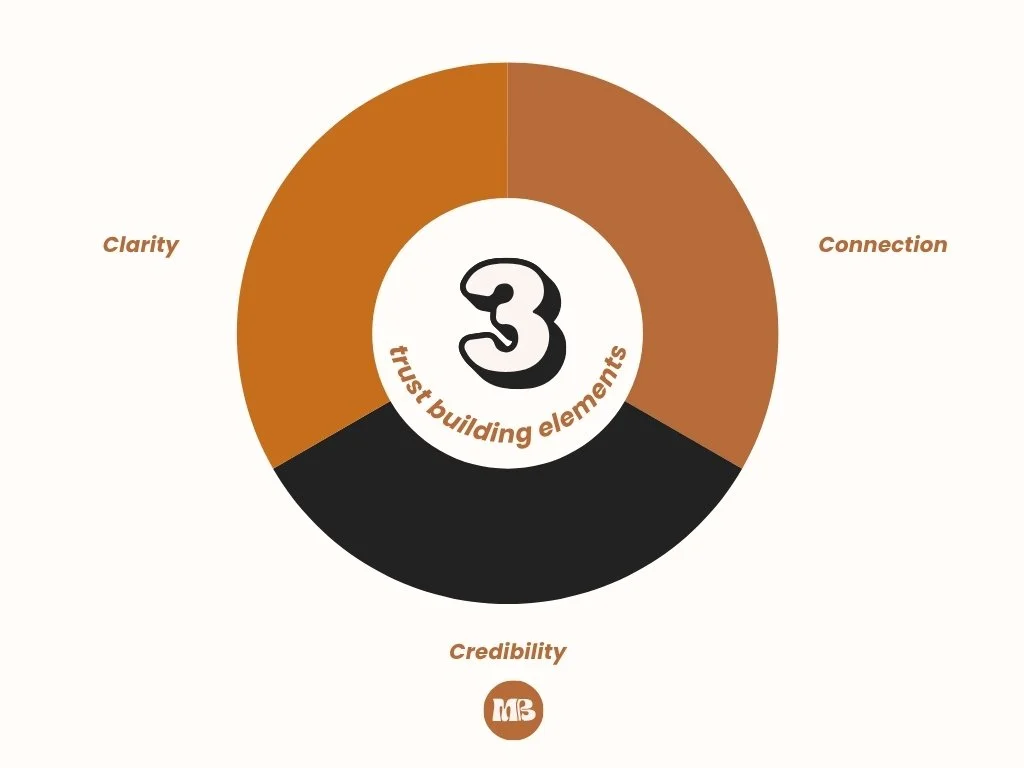
🚫Mistake #4: You’re Not Building Trust
Your ideal clients aren’t just looking for pretty they are looking for someone they can actually trust, especially in a world of Ai everything (there are Ai influencers making bank… yeah, that’s a topic for another day).
But most small business websites skip the very things that create trust: clarity, connection, and credibility.
Trust-Building Checklist:
Professional photos (yes, even one makes a difference)
Clear “About” page with a human tone
Real testimonials (with names & photos if possible)
Clear contact options
Privacy policy + terms (Google likes these too!)

💭Mistake #5: Your Website Doesn’t Make Them Feel
This is the one no one talks about but it’s often the reason people click away.
People don’t just buy based on logic.
They say yes when something feels right.
When it feels like you “get them” and have the solution to the very specific problem they’re facing.
Hint: It’s all about emotional connection but I show you how to build it inside the checklist. (Psst… You can grab it below 👇)
Your Fix: Write like you speak.
Use photos that reflect your actual client energy.
And make sure your “why” shows up in your copy, not just your offer.
Ready to Fix These Fast?
If you're nodding along to these mistakes, you're not alone.
The good news?
You're only a few changes away from a site that actually converts.
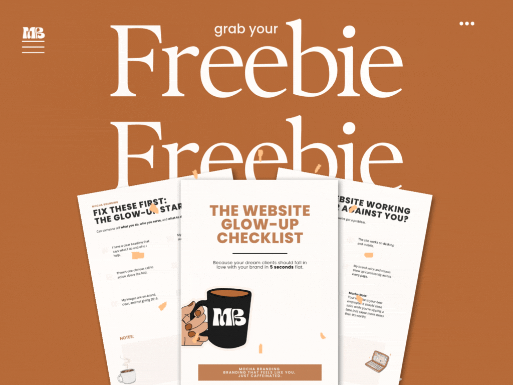
✨ Download my free Website Glow-Up Checklist for a step-by-step walkthrough to fix these today.
Or skip the DIY and get the full VIP experience:
FAQ (For My Over-thinkers)
-
Check your bounce rate, how long people are staying on your page, and if they’re actually clicking anything. If those numbers are low, something's not connecting with them.
-
Start with your homepage header. Make sure it clearly says who you help, what you offer, and what to do next(how can they pay you👀)
-
Yes! Consistent, strategic branding can increase trust, recognition, and conversions. People want to feel something(trust you) before they buy.
-
You can (that’s how I started) but only if you have a clear strategy and aren’t just copying trends. My checklist will help with that 😉
Still deciding? That’s okay.Before you close that tab, these are too good to miss…
Why Your Website Doesn't Feel Like You